UX Landing Page Design for Great Smart Packaging Experiences
By incorporating technology into product packaging, smart packaging takes packaging from static to functional, providing consumers with exclusive digital experiences related to the product or brand. In order to facilitate a successful experience, we at Touchcode take customers through a three-step process that leads them to a digital landing page on a website or app.
How do retail marketers ensure the process of getting to the landing page, as well as the ultimate destination, provide an amazing user experience? Here’s our insight on great UX design for excellent smart packaging experiences.
Design the packaging or packaging insert with clear instructions and a simple graphic image
Customers’ first exposure to connected packaging takes place when they interact with their connected packaging or product. Whether the package itself is printed with conductive ink, or the code is placed on a packaging insert or a collectible card product, it’s important to provide clear, concise instructions, with both text and images, so consumers understand what to do and how to do it. Give consumers a reason to use the code, whether it’s an exclusive professional makeup tutorial or a unique digital experience.

For example, Meyers, a Midwest-based print services company, handed out dress-shaped cards at a recent trade show that promoted a personal shopper experience and then led consumers to the Meyers website.

The back of the card provides clear, simple instructions to “Go to try.tc/P2PX”.
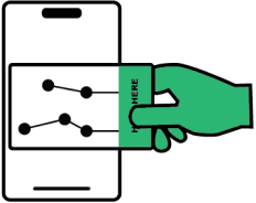
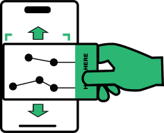
Further instructions say, “Put this card flat on display and move slowly to unlock an authentic brand experience!”
Provide encouraging feedback during the decode process
We call the process of unlocking a digital experience via connected packaging “the decode process,” and it’s important to make it a positive one for users.
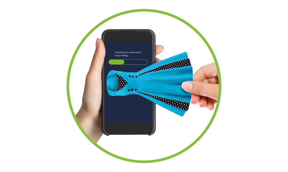
For example, as the user holds a card or package against their mobile device, the top of the screen could show a loading bar that says, “Unlocking your experience! keep holding…”
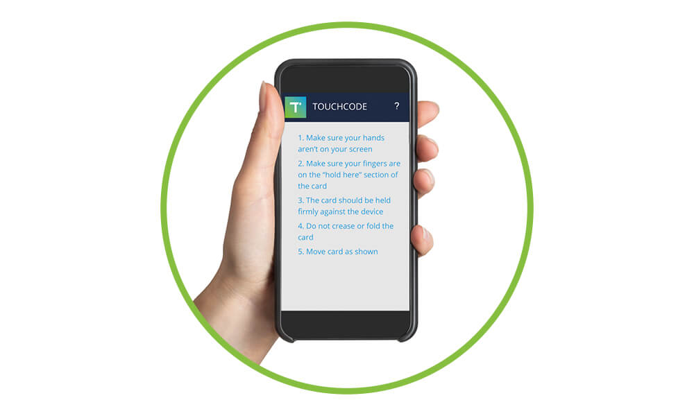
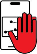
In the case of technical difficulty, a simple message that suggests the user “try again” and “make sure you’re holding the card firmly” encourages the user to complete the decode process. Graphic images like a question mark icon that users can press for additional tips (“Make sure your hands aren’t on the screen”, “Move card as shown”) can be helpful.
Celebrate success
When users successfully unlock the Meyers personal shopper experience, the screen flashes the word “Success.” This serves as succinct, clear confirmation that the user has reached the destination.
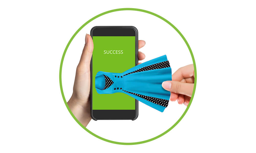
It’s possible to have some fun with this part of the process. Engaging, colorful graphics and celebratory copy make consumers feel positive and excited about what’s coming next.
Design an appealing, exciting landing page for users’ digital experience
When customers reach their destination, the landing page that begins their digital experience should be visually attractive, mobile-optimized, and easy to use, with clear instructions.
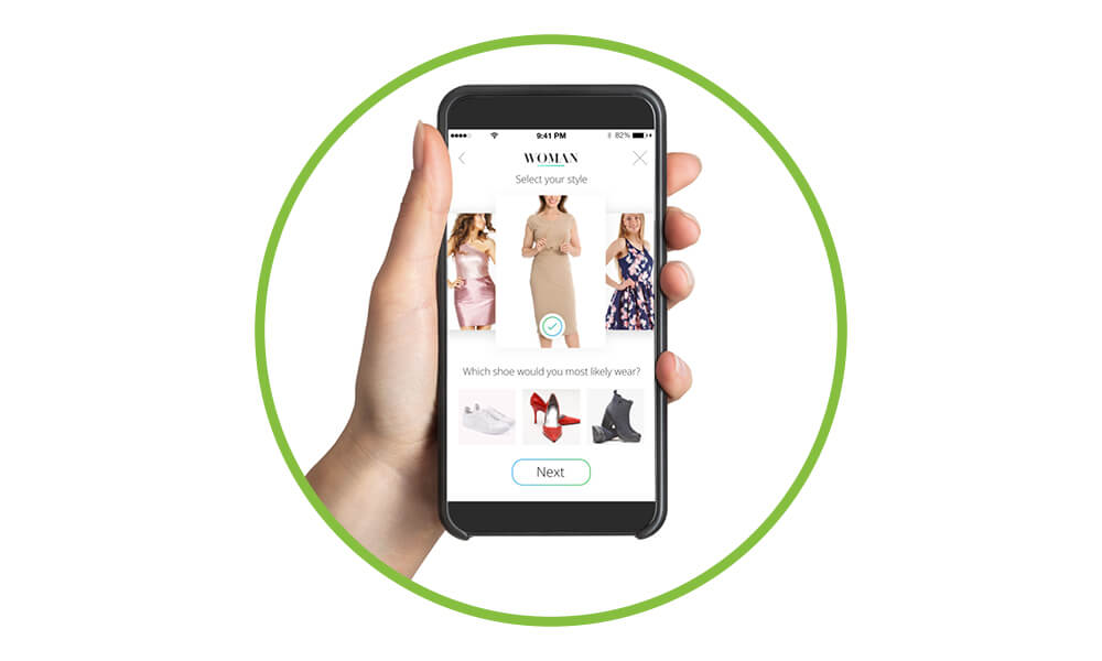
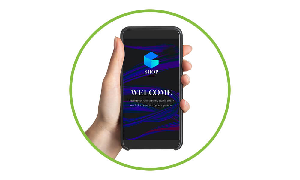
The Meyers personal shopper experience welcomes users and invites them to begin interacting with the page by responding to a one-question fashion quiz. It’s attractive, interactive, and easy to follow.
Best practices in UX design for smart packaging experiences
To ensure your customers have a fantastic experience using smart retail packaging, possibly for the first time, it’s important to follow these guidelines:
- Design the physical product, packaging, or insert with simple, clear instructions and a helpful graphic image.
- Give customers an incentive to use the code.
- Provide encouraging feedback and a dynamic visual during the decode process.
- If the decode isn’t working correctly, offer additional feedback and ways to get help.
- When the decode is successful, provide energetic, celebratory copy and possibly exciting graphics.
- Design an enticing landing page for the customer’s digital experience that is easy and enjoyable to use.
Your goal with connected packaging is to lead your customer to the digital content that awaits them in a clear, enjoyable way. By linking customers’ physical and digital brand experiences through clear copy and clean design, your customers’ smart packaging experience has the potential to dramatically impact your business in a positive way.
Ready to learn how Touchcode’s connected packaging technology can help your brand create deeper relationships with customers? Contact us today.
